Every organization has key ideas it wants to be top of mind when you or I say their name. Whether you call these “key messages” or “brand promises,” you’ll often find them in taglines, copy and videos on top levels of the website. You’re less likely to find them woven into the content of deeper pages. But these deeper pages are likely the content people came to find.
Top Task Pages
Top task pages are the pages for the most important goal, task or question people have when they come to your site. On an ecommerce site these are pathways to products. On a higher ed site these are degree programs, then some mix of admissions requirements, location, and cost.
Gerry McGovern, originator of this “top task” concept and a methodology for uncovering them (https://gerrymcgovern.com/), says “People come to your website running.”
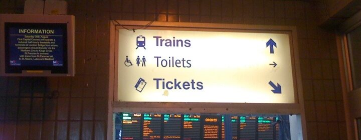
Imagine a busy train station, a driver drops you out front with your luggage, you come in the door, there are signs everywhere, there are really only 3 things you care about: Trains, Tickets, and Toilets. All the other stuff is noise until you’ve accomplished your primary goal.
We see this pattern in all our website analytics. IF people start on the home page (they often enter deeper if they used a search engine), they make a beeline for the first obvious link they see that looks like it goes to their top task (sometimes it’s not the right path, unfortunately).
They do sometimes notice key messages on the home page, but they don’t engage much with content until they reach the pages for their top task.
Universal user experience truth:
If someone comes to you on a mission, with a key question –answer their question!
Help them accomplish their top task! Make that experience delightful and interesting. During or after accomplishing their top task, they’ll be open to your key brand messages.
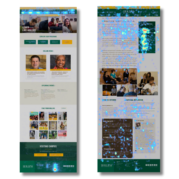
For higher ed this means that prospective students won’t pay much attention to your brand messages until they reach and start to explore the degree program. These heat map screenshots show engagement with the homepage of a small private university, alongside a degree program page. The hottest spot on the home page is the “Academics” navigation link – the top task path. Notice how much more people are engaging with content on the degree program page.
This is why you can’t separate brand strategy from user experience and content strategy. A user’s first impressions about your brand are heavily impacted by the experience they have pursuing their top tasks on your website. They will always infer things about the institution itself from the experience of the website. Unless “out of date,” “disorganized”” or “pretty much like everyone else” are brand attributes you want to communicate, you must focus on the content and experience users find when they reach their first big goal on your website.
What impression do your top task paths and pages give? Find out with this easy test.
Claire Brookes and I gave a presentation a few years ago at CASE Europe on brand differentiation in higher ed. To illustrate this effect, we had everyone pair up with a partner to conduct a test that you can easily reproduce with your own website.
Each pair was given one of these two personas and asked to look for the desired degree program on one of four university websites we assigned.
Tara
- Discovered love for physics with excellent teacher in high school (or secondary school in the UK), test scores confirmed this interest.
- Starting senior year (final year of 6th form college in UK).
- Trying to decide whether to stay close to home or go farther (even abroad).
- Plays piano, would like to continue interest in music while at university.
Marcus
- Good student, not a “conventional” thinker.
- Has produced videos for his school.
- Would like to do something with media, film or communications — not exactly sure yet.
- Taking a media studies course.
- Wants a degree program that’s flexible, can tailor to his particular interests.
We tested with two universities from the US and two from the UK.
As the partners moved through a website, they had to explain to each other what they noticed or were thinking on a page, and they had to agree before they could click on anything. This sort of “paired usability test,” while not entirely realistic, is a great way to elicit what’s going on inside someone’s head as they pursue a goal.
After about 10 minutes, we asked people to answer these questions for each of the four universities:
- How would you describe this university?
- What would you tell your friend about this course/major?
- What do you think this university is known for? What sets them apart?
- With a thumb up, down or somewhere in between, would you apply now or keep looking?
Admittedly, this was a room full of higher education professionals, not 17-year-olds, but the results were striking. One might expect higher ed communications professionals to seek out some key messages (after all, we help write them), but they behaved pretty much like the 17-year-olds we observe.
Bear in mind that these were all elite universities we selected for the test. Claire and I had already reviewed the key messages of each institution prior to the workshop, so that we could see how much of them were echoed by our participants after the test. The answer? Very little, perhaps 10% at best. We were more likely to hear words like “confusing,” “standard” or “uninspiring.” Only one of the four universities managed a clear win on the thumb meter.
Prove it for yourself.
I encourage anyone to try this test on your own website. It’s easy to reproduce and the research question is simple: Do or don’t visitors to your website come away…
- Having met their goals?
- Believing the truths you want them to know about you?
- Inclined to choose you?
After you try it, consider focusing on the top task content on your website and using that as the place you begin to prove what you promise. Then make that top task content easy to find, no matter where someone starts!
In higher ed, if you want to be smart about attracting prospective students, that first goal is the degree program. Start there. Make it great. Trust us, nothing else (except maybe your home page) is more important.