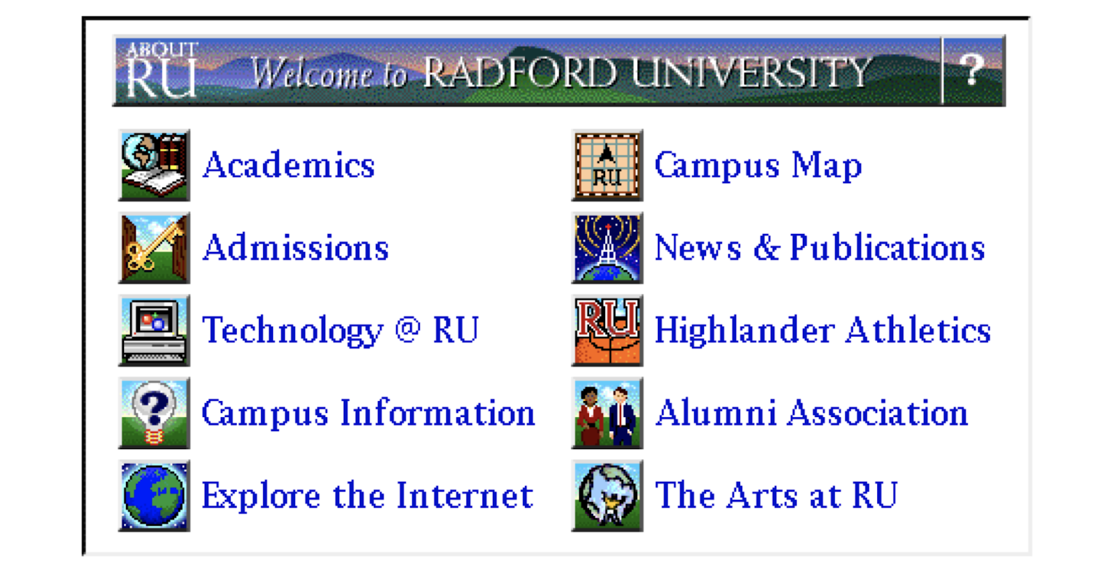
I started out as a print designer. In college I spent as much time messing with computers as I did designing with them. So when the NCSA Mosaic web browser came out the year after I graduated, and I was working at Radford University with access to broadband, I knew I had discovered my medium. In 1994, I created Radford University’s first website by hand, painting graphics pixel by pixel and writing every line of HTML.

But Radford didn’t have a permanent job for a webmaster back then, so I set out on my own, determined to create the sort of place where I’d always wanted to work.
That imagined future is the company where I work today. You don’t make it for 25 years in business without tenacity in the tough times (pandemic anyone?), but NewCity in 2020 is the team I dreamed about in 1995 – endlessly curious, committed to each other and our clients, always reaching higher and striving to win together.
What difference have we made in 25 years?
Reaching higher doesn’t just mean for NewCity. We’re always seeking to move our industry forward through leadership in methodologies that raise the game for everyone. Sharing what we learn and practice has always come back to us in the form of better opportunities and smarter expectations.
When you have your head down focusing on the path in front of you, it’s easy to lose sight of how far you’ve come. 25 years is a pretty good point to pause and reflect. What difference has NewCity made in two and a half decades? Have we made a dent in the internet?
I’d like to highlight five places where I think we’ve made a real impact:
1. User research is an expected part of any serious web project.
In the 2000s we were fighting to convince organizations to invest in user research to inform their architecture and design decisions. In 2007 we landed our first major Higher Ed project with Virginia Tech on the strength of our proposed research approach, using Indi Young’s mental model methodology. Our work for Virginia Tech was the first example we know of a university applying rigorous user research (not just market research) to its website strategy. Now nearly everyone who comes to us about a project places value on audience research as a foundation for strategy. In-house user experience positions exist where none did before. Leaders value the market advantage that comes with human-centered design.
2. Content strategy has a seat at the table.
More than 17 years ago, Jared Spool’s firm User Interface Engineering demonstrated that 50% of usability problems are caused by the words we write (or don’t). But for years content within many websites was neglected, often relegated to people with no time or relevant expertise. Web design firms would create beautiful templates and let others worry if the content was any good.
In the late 1990s several industry leaders began talking about the importance of content strategy — and more importantly — proving the power of user-focused content. In the 2000s we encouraged our clients to use better storytelling and vivid details to awaken readers’ imaginations. We spoke at conferences and advocated for effective web content. In the late 2000s, we started to see actual budget devoted to it, even if it was small. Then the iPhone was introduced in 2007, and by 2011-12 responsive design was becoming a thing. Mobile forced everyone to get serious about brevity and clarity. In 2012 we hired our first full time content strategist and expanded our offerings.
Today we’re seeing organizations invest significantly in content as a valuable resource and cornerstone of their digital marketing strategy. Content strategy is an expected counterpart to site architecture.
3. Data is enabling organizations to make decisions based on real user needs and behavior.
Analytics have been important infrastructure since the dawn of the web. But a decade ago few organizations we talked to were using this data to create better experiences for users. Mostly you just heard things like, “We get this many visits and page views per month,” or, “these are our top pages.”
We’ve helped our clients make tremendous strides in this area, relying on analytics to answer strategic questions about audiences, track goals, and prioritize improvements. Conversations about new projects are starting with a higher expectation of the impact analytics can have when paired with a commitment to ongoing improvement.
4. Signs of unity between marketing and IT.
Putting the developers who support your web presence into a separate organization from the site architects, designers, and writers is one of the most counter-productive things I’ve seen in 27 years working with the web. Who says only IT people can manage developers? When marketing and IT are separated, the IT side often develops a trouble-ticket mentality focused on putting out fires rather than moving the organization’s digital strategy forward. Marketing ends up having to fight for resources or do end-runs around IT leadership to get things done, leading to technology decisions that are not in the best interest of the organization.
But in the last 5-6 years we’ve seen signs of change — more and more organizations are building unified multidisciplinary web teams. A new generation is blurring the lines between ux/design/writing/development. This is good, let’s keep going!
5. Responsive web design and accessibility have forced us to get smart about front-end frameworks and design systems.
A tremendous number of website redesign projects in the last decade have been driven by the need to make websites mobile-friendly and compliant with laws governing accessibility. This need has led to a renaissance in smart, semantic front-end code that is easier to manage and re-use.
When the web first started there was a huge debate over whether HTML should be kept free of presentational markup so that the user could control their reading experience, or HTML should allow web designers to control the way everything looked on screen. Web designers won, leading to the advance of Cascading Style Sheets and JavaScript (and yes, Flash) to craft online experiences.
Responsive web design and accessibility have driven a move back to the middle, giving users more control over their experience and ensuring that semantic markup describes the purpose and structure of the content — making it easier for web content to be enjoyed in a variety of contexts, including screen readers for the visually impaired.
But building in all the smarts for responsive web pages and accessibility considerations TAKES WAY MORE TIME and thought than our old fixed-width methods. What do developers do when they have to create something complex over and over again? They create frameworks and re-usable libraries that allow you to build a template with tested blocks instead of writing code from scratch.
The same pressure has led UX architects and designers to create user interface patterns with variable options that can be reused to create a wide variety of templates and interfaces. Reusable design patterns means reusable code patterns, which brings the time and cost down for building custom, dynamic, responsive, and accessible websites. All of this has set the stage for a new era of sustainable, scalable digital infrastructure.
It’s also created a new challenge for content strategy. Creating content for a website using a pattern library requires new skills that most web editors haven’t had to consider.
We’re among several leaders who have been writing and speaking about this over the last 4-5 years, including our posts on layering content and writing content that works everywhere.
Change Demands Leadership
Looking back at each of these areas I’m reminded why I love working in digital. The technology keeps changing, but it’s always about connecting people and ideas. I’ve seen what a huge impact it can have on people’s lives and success. I’m also struck by the need for principled leadership in digital media.
The Coronavirus pandemic has both increased our dependence on digital and shown us its limits. My hope is that when we can gather freely again, we will cherish what digital cannot give us. We need leaders who recognize how digital fits into a broader journey, who can weave it into holistic brand experiences that are deeply human. The last few years have also shown that as much as digital media extends the reach of ideas, it can be a tool for radicalization and division. We’ve learned some things about human nature that aren’t pretty – what we’re capable of doing and saying when we’re not talking to someone face to face, how easily we can be persuaded by well-crafted misinformation, and how quickly misinformation spreads when it’s something we want to believe. NewCity may never wield the influence of a social media giant, but we can lead with our eyes open, respecting the power of the tools we create and promoting human-centered design for good.
Here’s to the next 25 years!

