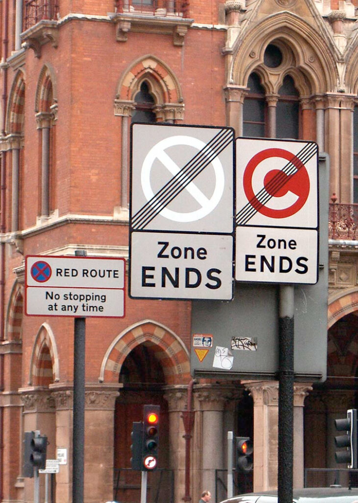
The idea of red routes comes from London’s traffic planners. They realized that 5% of the roads in London carry up to 30% of the city’s traffic. By keeping red routes open and flowing, they alleviate congestion across the city.
Websites have red routes too. These are the pathways to the top goals that each of your audiences have. For example, the red routes for a prospective student include:
- Find the degree program information, then answer my basic questions about it:
- What will I study?
- What are the faculty members like?
- Can I get in?
- How will this fit in with the rest of my life?
- What do other students think about the program?
- Figure out how much it costs, and how I can pay for it
- Understand the application process

Too often websites, like cities, clutter up these red routes with confusing signage, unnecessary content or promotion of unrelated info. We’ve seen many websites where the most important next step for the user was just a link in a paragraph – as easy to miss as an alleyway or side street.
Facilitate a Content Planning Workshop for Red Routes
This exercise is based on the idea of Core Content that we learned from Are and Mona Halland (see their 2007 IA Summit presentation) and Ida Aalen. Ida Aalen has a more in-depth depiction of the exercise in her post “The Core Model: Designing Inside Out for Better Results” on A List Apart. Core pages are your red route pages.
In this exercise workshop participants design pages that answer user questions and keep them moving forward, all while communicating the ideas you want to get across.
Have your participants pair up. They’ll work together on a collection of pages where they have expertise.
Writing for Interactive Reading
Web writing isn’t about what you want to say, it’s about balancing user needs with your institutional goals. You want to help users find what they’re looking for quickly and efficiently (so they’ll come back), and you want them to get your messages.
To identify the most important content on your site, think about user paths, not page hierarchy or number of clicks it takes to get there.
The most important content lies where your goals and your users’ tasks overlap (like applying for admission or finding a submission deadline). So, if we support the pages along those user paths, we can focus our efforts on what matters most to everyone. These are your “red route” pages.
These are the instructions we give to participants:
You may want to explain the London traffic planning example here, it helps the idea stick in people’s heads as they think about web pages.
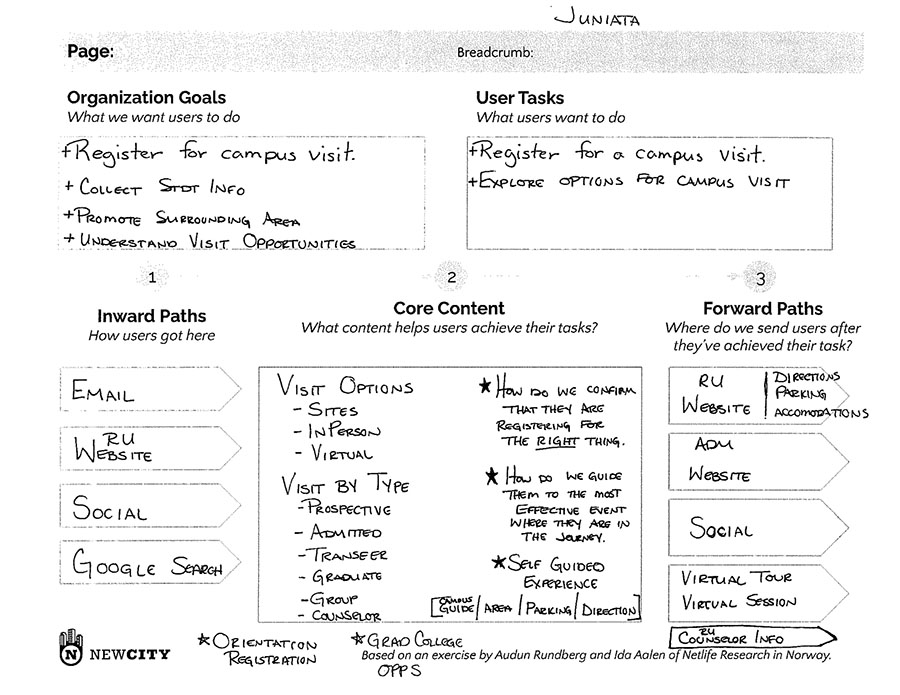
Exercise: Plan Your Red Route Content
- Identify your red route pages. Write down business goals and user tasks.
- Fill out the planning worksheet for each page, answering
- How will users get to this page? How will they find it? (On your site, and elsewhere.)
- What content elements do you need to provide to help users complete their tasks (while respecting your objectives)? What words do you need to use?
- After users have completed their tasks, where do you want to send them next?
- Now try mobile! Prioritize each page element to decide what order they should appear.

Questions to Consider
- Are there other channels you own that can support these red route paths?
- Are forward paths natural and context-appropriate, or just what you want users to do?

