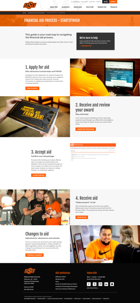
Pillar 6 of NewCity’s Seven Pillars of Higher Ed Digital Strategy offers tactical steps to reduce complexity for prospective students and families and improve your admissions, cost and financial aid content.
Simplify, streamline and clarify
The experience around applying and paying for school presents a real speed bump to many students and families. Every admissions and financial aid professional we’ve talked to knows this – and yet we still see bewildering content and processes on admissions and financial aid sites.
Why is this such a big deal? According to Niche.com’s survey of 5,630 high school juniors in 2024:
- 61% of students cited applying for financial aid as a challenge they will likely face.
- 54% said paying application fees or figuring out how to apply would be a challenge.
Other studies¹ show that first generation and rural students are much less likely to have someone in their life to guide them through the process.
What admissions and financial aid professionals may not realize is that this speed bump may become a roadblock – it can be the reason why a student takes your school off their list. Watch a usability test as a student or parent tries to estimate how much it would cost to go to your school compared to one of your competitors. Or try to figure out the transfer application process. If you come through it without wincing we congratulate you.
People who manage these processes sometimes point to federal regulations as a reason for the complexity, but we’ve seen teams do a good job meeting the requirements while still making everything accessible and understandable.
Improving your admissions, cost, and financial aid content takes work, and not just for a good web content editor. An editor has to work closely with staff to streamline the information while ensuring the details are correct.
Remember too that complex web pages may reflect complex processes. Don’t be afraid to ask whether an internal process might be streamlined to simplify life for students and parents (and probably for your staff too).
We asked this question while leading a project with a major state university to make it easier for parents to pay tuition. Parents have to first get their student to sign them up for access to their account. Then they have to figure out how to pay. This university relied on two different systems depending on whether a parent wanted to make installment payments or pay the full amount at the start of the term. Parents were understandably confused. One leader in the Bursar’s Office was reluctant to change the process at first, saying “people just need to read.” Then we showed them clips from usability tests with parents. They threw their support behind the changes, and the streamlined site delighted parents. A little empathy for your users goes a long way!
In short, every investment we’ve seen schools make to simplify, streamline and clarify the admissions and money part of the experience for students and parents pays dividends for years.
12 Steps to Improve your Admissions, Cost and Financial Aid Content

Identifying Opportunities and Prioritizing Improvements
This is a straightforward approach to identifying and prioritizing improvements to your admissions and financial aid sites.
1. Know your Red Routes for admissions, cost and aid.
Red routes are a metaphor we use in information architecture, borrowed from London’s city traffic planners. 5% of London’s streets carry 30% of the city’s traffic, and if they get blocked, movement in that area quickly grinds to a halt. So they work hard to keep them open. You may also hear them called Top Tasks – it’s the same idea.
Red routes for admissions, cost and financial aid are things like:
- Who do I contact for this specific question I have?
- What are my realistic chances of acceptance?
- Could I possibly afford this school?
Download a PDF of our comprehensive list of red routes for the admissions, cost and aid parts of your website based on decades of research with students and parents.
2. Review analytics on the current sites, and set up analytics KPIs to track how people progress on these Red Routes.
Within the admissions, cost and financial aid parts of a higher ed website the KPIs we most often see schools focusing on include:
- Attribution modeling for enrollment campaigns that lead to key conversions
- Application starts and completions
- How many people are scheduling visits
- How many people are hitting a significant % of the key pages along one of the Red Routes
- Scroll depth on key Red Route pages (demonstrates engagement)
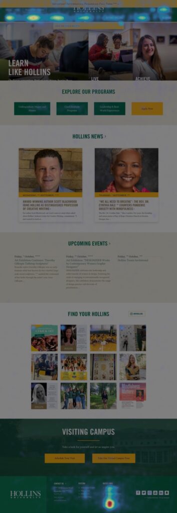
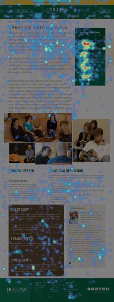
Consider installing behavioral heat map tracking on key pages along your Red Routes if you don’t have this already. They show how far people scroll, where they move their mouse and where they click. This isn’t the same as eye tracking but has proven to be a good proxy for attention.
These visualizations help your enrollment team see how people respond to their content, and whether their efforts should be concentrated in other areas. This is an example of a heat map for a college home page compared to a degree program page. Color indicates any place where their mouse hovered or they tried to click.
3. Walk through the Red Routes yourself.
Fill out an RFI. Schedule a visit. Set up an account on the application portal, then apply.
4. Test your Red Routes with real students and parents.
You can do moderated or unmoderated usability tests. We recommend doing comparative testing as well, where they try something on 3 different sites including yours.
5. Talk to the people who talk to students and parents during the process.
What do they have to help people figure out on your website? Listen for what workarounds they offer students and parents in understanding and navigating your processes. If they have to explain to people how to navigate the website, or how to do something that is different from or missing from what’s on the website, you’ve found an opportunity for improvement.
6. Based on all of the above, outline what students and parents need to know, or what advice they should be given to navigate the Red Routes successfully.
Compile a list of these things and where they’re needed, and hold this for when you map out your content changes.
7. Work with admissions and financial aid to identify any places where the processes themselves could be streamlined.
As you do this, consider too how you could give students and parents a better idea of what to expect next in the process. Explain or refer them to something that shows an overview of the process with timeframes. Or let them know when they can expect a response.
8. Review all pages for redundancy and web writing best practices.
There are many great books and resources for web and UX writing best practices, which is beyond the scope of this article. The very best book on this topic is still Ginny Redish’s Letting Go of the Words (2007). When we review any web content we ask questions like:
- Does it have short, not overly wordy paragraphs?
- Does it have some content that only serves a small segment of the audience, and could be moved to a linked page?
- Are things that should be lists or tables presented as such?
- Does it have clear headings and links?
- Are the next steps obvious?
With admissions content it’s easy to end up creating multiple pages that address the same need with slight variations. This can trip up students and parents with contradictory or incomplete information. A periodic review of site content for redundancy keeps this in check.
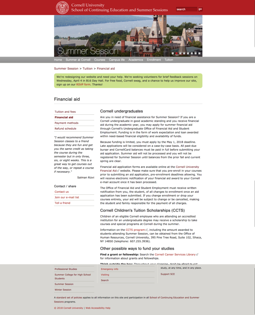
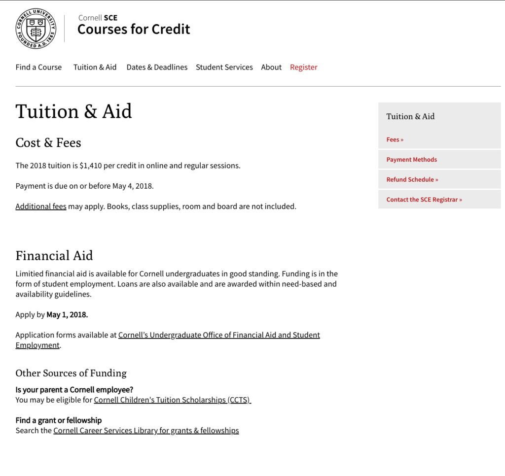
This is one of the pages we worked with Cornell School of Continuing Education to revamp. It explains ways to get financial support for summer classes. The version on the right conveys all the same key information as the version on the left, but we’ve made these improvements:
- Wrote headings that communicate exactly what the content under them is about
- Shortened all instructional text to the minimum required to accurately communicate the information
- Removed redundant content that is repeated on the financial aid site, and linked to it instead
- Moved content that only applies to a few people, like children of Cornell employees, onto a separate supporting page
Implementing Improvements
9. Plan changes to the content on key Red Route pages
You need to plan both at the site map level and the page level. We recommend tools and exercises like a Content Work Plan and Core Content Modeling.
When we redesigned Radford University’s website we paid particular attention to their admissions, cost and aid pages. We proposed a new landing page titled “Cost, Aid & Value” with the primary goal of giving context to prospective students (especially first generation) so they wouldn’t see cost as a false barrier.
We kept the page friendly but fact-focused, and ensured the next steps along this red route were obvious: 1) understanding tuition, 2) estimating net cost, and 3) learning about financial aid.
Content plan for the page |
|---|
| Cost, Aid & Value
/admissions/cost-aid Goal: More facts than fluff, sound friendly but don’t say they’re affordable, give proof points as much as possible to quick-answer those questions/make the case, for prospectives not staying long enough to click through to the linked pages. Primary job of this page is to give context to prospective (especially first gens) so they don’t see cost as a false barrier and secondary is to route to them to the correct few pages we want them to see next…so this one will be short and that’s ok.
|
Final page design

10. Prototype and test improved versions of Red Routes and the key pages along them.
You may need to set up a clone or sandbox version of your admissions and financial aid sites to do this, or you can create a clickable prototype in an app like Figma. Prototyping and testing doesn’t have to be expensive. You have a lot riding on the success of these pages, a little testing now will save you a lot of work later.
11. Fully implement and launch the improved structure and content.
A good content work plan is the perfect tool to manage this process. You may find that AI editing tools can speed the process for you, but there’s no substitute for a real human ensuring that the content is hitting the right tone for your audience and that each page achieves its purpose.
One more round of usability testing at the end of this process never hurts – and you can use unmoderated methods to get quick validation that your hard work will deliver the results you anticipate.
12. Track before and after KPIs, and establish a rhythm for review.
Creating a platform, measurements and rhythms for sustainable growth is the focus of Pillar 7: Establish a Platform and Rhythm for Growth. At this point you should already have a good CMS and you defined your KPIs at the beginning. All that remains is to decide WHEN during the year you will regroup with all the right folks, review your analytics and decide about any changes you’d like to try in your next iteration.
You’ll obviously want to keep an eye on your KPIs during the high engagement periods of the enrollment year, but these may not be the best time for thoughtful reflection and careful design of improvements. If you see a red flag during these high pressure times, like a big year over year drop in one of your conversions, run some quick usability tests to identify the culprit and fix any glaring problems.
But think about a quieter time of the year when you can do a more thorough analysis of how everything performed, with some time set aside from your web and content folks shortly afterwards to implement and test proposed improvements.
Conclusion
We hope these insights are helpful as you look for ways to streamline the enrollment journey for students and parents for your institution! NewCity partners with admissions and financial aid teams in a variety of ways to boost enrollment outcomes.
Review our enrollment strategy services.
Curious what it looks like to team up with NewCity on a project like this? Read our Admissions site case studies, or ask for our references!

David is the founder and president of NewCity. He teaches workshops on UX and content strategy.
¹First-Generation Student Needs Assessment, Stephen F. Austin State University Student Success Center, November 2022 https://www.sfasu.edu/docs/ssc/genjacks-student-needs-assessment-report.pdf
Miles, Tia, “The College Search Process of Rural, First-Generation Students” (2023). Dissertations, Theses, and Projects. 814. https://red.mnstate.edu/thesis/814/

