
The fourth of NewCity’s Seven Pillars of Higher Ed Digital Strategy illuminates what it takes to start a conversation, and good ways to maintain it all the way through the student enrollment journey.
What’s in a digital conversation?
Independent Enrollment Consultant Robynne Lofton spent 26 years in admissions and enrollment positions within higher ed institutions. Her work and her team’s motivations revolved around student conversations.
“After five minutes of talking in my office, I could see in a student's eyes that they were squaring their assumptions about the school with what they were learning with me. I wasn’t just asking questions and answering theirs. I was communicating on a deeply human level. Through word choice, body language and energy, I was conveying a sense of the nature, values and culture of my institution. I was trying to deliver the message that at this school, the student would find people like me committed to supporting their educational journey”.
So, can your website do that?
Not in the same way. Website interactions don’t usually produce oxytocin that can put a nervous 17 year old at ease. But they can communicate- with words, images and effective UX and IA- a sense of support, helpfulness, curiosity and even warmth. And with a strategic call-to-action plan, your website can consistently offer opportunities to link back to a real person at key moments in their journey.
Let’s explore how some of this works with a UX principle called progressive communication.
How your website can start a conversation
Progressive communication is rooted in the idea that digital interactions can be designed more like conversations, with a simple question and answer progression toward some end result. It is tied to the UX principle of “progressive disclosure”- the idea that users only need to see the information most relevant to them, but can access additional information by performing another action.
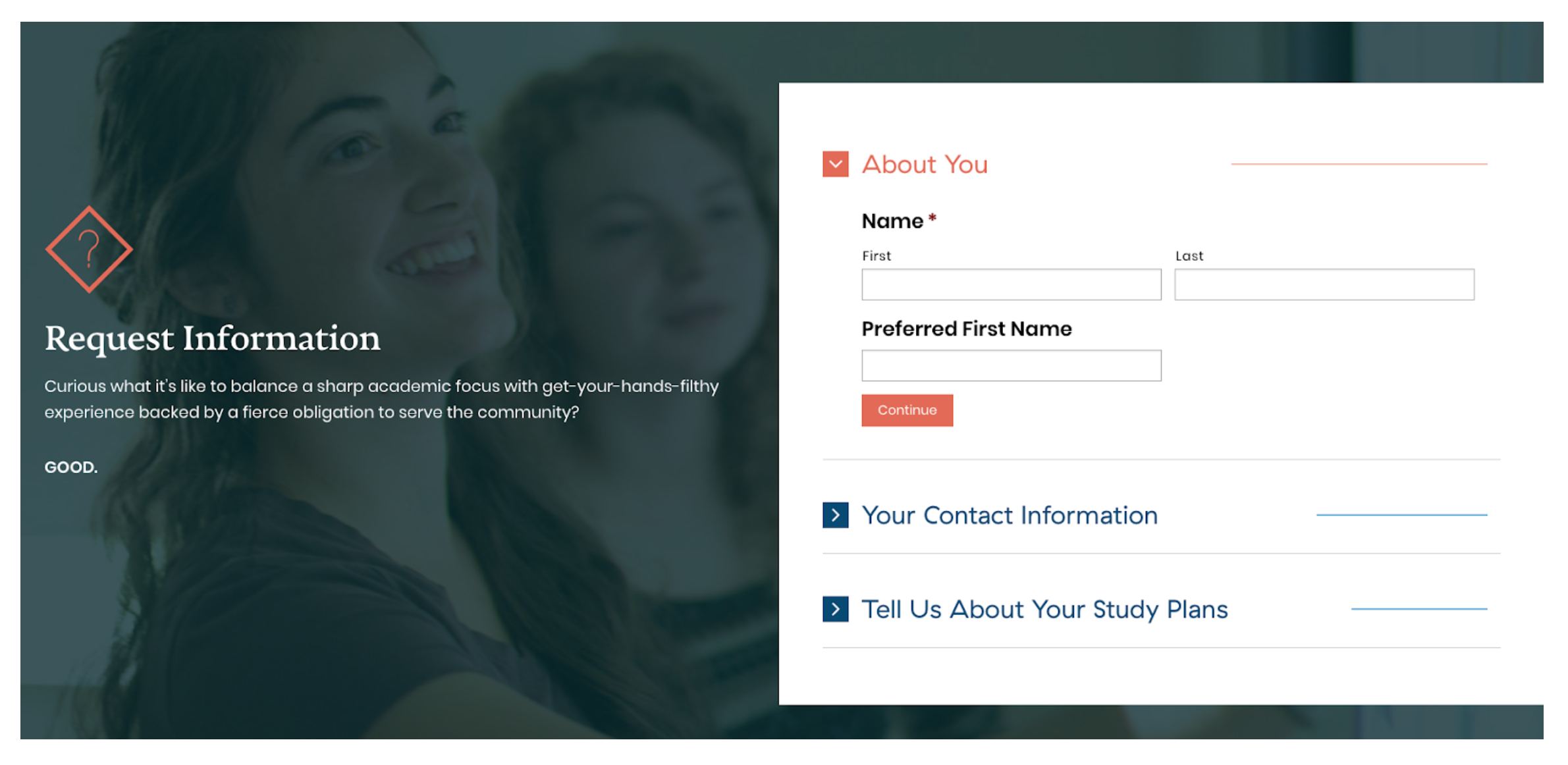
Higher ed websites are commonly built around 3 main conversions – a request for information form, scheduling a visit, and the application. RFIs are helpful, but the basic message is “Fill out this (ridiculously long) form and we’ll send you some more information.” People are right to expect that all the information you would give them is already on your website. So is there a better way to approach these invitations for someone to engage with you?
You start by asking questions.
You could ask “What’s the most important thing to you in your search for the right school and program?” and prompt them to choose from answers like “Financial Support,” “Research Opportunities,” or “Learning from Prominent Faculty.”
Continuing the conversation with relevant information on “Learning from Prominent Faculty” is going to differ by program, so the next logical step in their page path would most likely be choosing their degree program page. Once there, you can deliver content that answers their top questions, offers further exploration (i.e. “check out this professor’s latest journal publication”) and nudges them along the enrollment funnel.
Our client Warren Wilson College upended the traditional longform RFI with a refreshing take on a form that piques attention, reduces visual overwhelm and starts a digital conversation. They posed a question, and then asked users to use drop-downs to input additional information. This approach garnered them a 142% increase in RFI submissions!
Exploring degree program pages
Providing an easy path to find and compare degree programs can be a form of conversation too. It’s like asking the student who walks into your admissions office “What majors or programs are you thinking about?” or “Do you have an idea yet about what careers you’d like to pursue?” Their interactions on the website tell you something about their first questions. This behavior can be captured and later incorporated into their record in your CRM, enabling you to be more responsive in later conversations.
The best examples of these pages all include visually interesting page layouts and component design, and thoughtful pacing. Take a look at our client Westfield State’s Accounting B.S page.
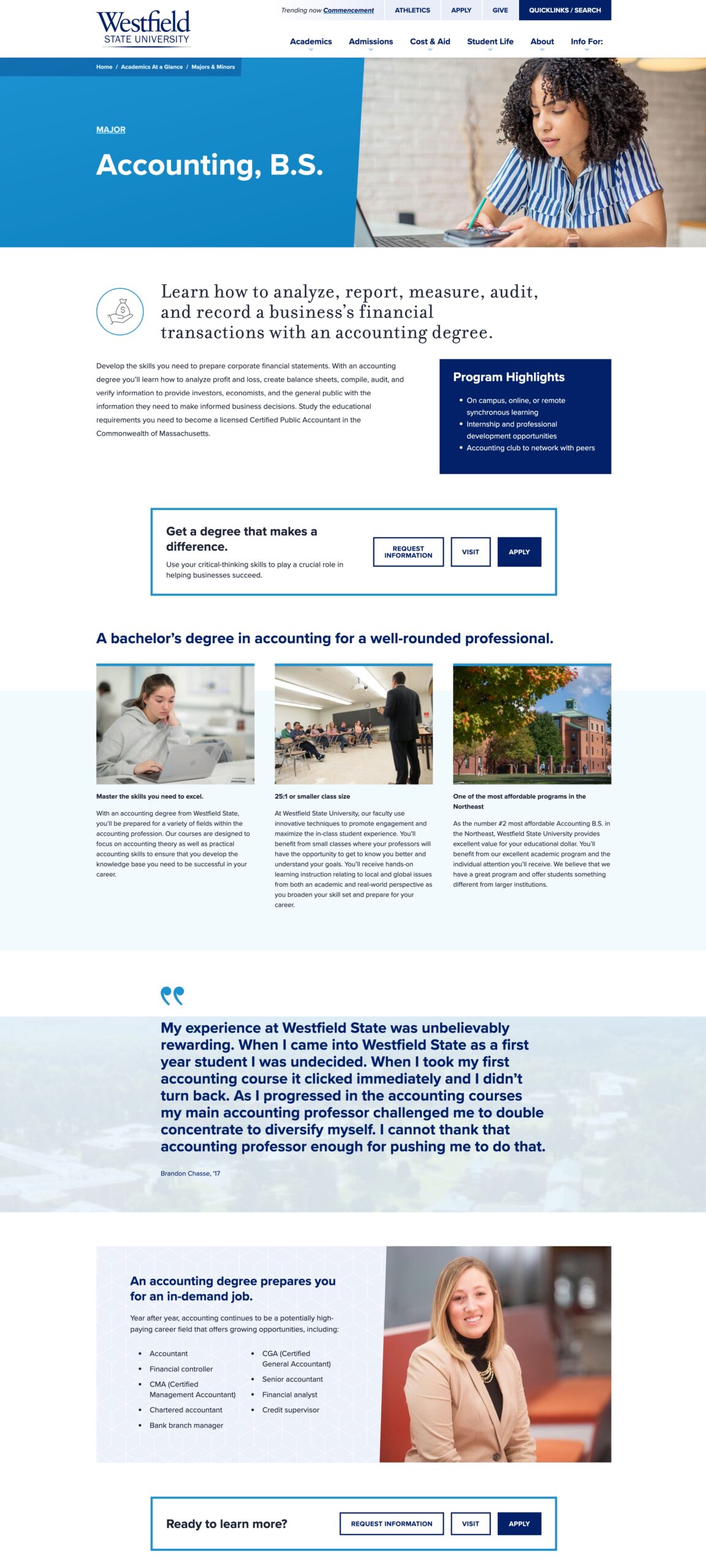
The potential student is immediately offered key program information, highlights, and calls-to-action to learn more. Then, there are three main program benefits laid out in an easy to consume three column component. Next, a testimonial offers a pause and some personal insight.
This UX and pacing takes into account that with a lot of information to convey, it’s helpful to share the critical parts in different stages and different formats. Just like an admissions counselor in an in-person conversation might offer a specific detail about academics or student life when they sense a student is interested in learning more, or pause for a question.
Write like you talk
“The digital experience should entice and engage, and invite and inform. It's the gateway to the in-person experience.” – Robynne Lofton
Higher Ed messaging can get pretty aspirational, and for good reason. Schools have big missions and much to offer students who might need to be convinced of the value of higher education. But if a 17 year old walks into your office for a visit, you probably wouldn’t say to them “are you ready to transcend boundaries and find your voice?”. You’re going to meet them where they are. The language and tone of your website content should reflect more of the approachable, every day conversations that your admissions teams are having with prospective students, especially along key conversion pathways.
One place where we see this go awry is when a prospective student visits your homepage where maybe you’ve implemented some of this friendly, student-centric language. You’ve welcomed them to the site, you’re using second-person point of view and addressing them directly with “you” statements. Everything feels conversational until they land on your degree program pages, and it’s like they’re at a different institution altogether. The language has changed. They student is reading big blocks of text that sound like this:
“To satisfy the requirements of the program the student must complete coursework from…” and “The institution aims to provide…”
This can feel as jarring for students as being in the middle of a pleasant conversation with one person, who suddenly runs out of the room and is replaced by an unannounced stranger reading from a manual.
Maintaining a consistent voice and tone across pages and pathways is not easy. It’s delicate work to balance organizational and student needs within every message. And beyond the work of consistent voice and tone, the effort is also a strategic one undertaken behind the scenes by enrollment, marketing and academics teams who must align on their individual goals (more on this in the forthcoming Pillar 7).
Sometimes our clients tackle this challenge in stages. They work on a group of priority degrees and programs first, slowly gaining buy-in from their cross functional teams. When successful results make it clear that the approach is working, it’s easier to roll it out across your whole site.
We talk a lot about inspiring imagination and creating vivid experiences with words in the previous pillar of this series Show Me the Experience. Read that for a refresher on how to use action verbs, stories, humor, surprises and even poetry to make your content and messaging appeal to readers.
Is your website set up to listen?
Good conversationalists do at least as much listening as they do talking. They use empathy, patience and curiosity to connect with their partners and discover the information, insights and values that make conversations mutually beneficial.
Your website can listen too. And with a digital strategy in place to support these web interactions, it can also respond appropriately, offering up a pathway to additional information or another opportunity to engage.
How? You can set up your website and analytics platforms to pay attention to the behaviors that signal increasing engagement with your institution, like:
- Spending time with the degree program and supporting pages
- Looking at tuition and fees
- Looking at information about campus visiting days, tours, etc.
- Viewing at campus photos or videos
You can track these interactions through tools like GA4 and Hotjar, and then analyze key metrics that will help you improve pages and even create targeted outreach campaigns.
Going a step further, when these web visitors convert on a form and provide you with their contact info (First Party Data) they are signaling deeper interest that you can respond to by adding them to your funnel and sending them targeted communications that continue the conversation you started.
Show me the humans!
Look at your average college or university website, and you’ll see plenty of photos of students having conversations with each other. But what about everyone else on campus? The faculty, administrators, admissions counselors and other personnel who comprise the local color and culture of an institution?
For the digital experience to reflect the in-person experience and deliver a consistent sense of brand throughout the student journey your website should surface the people prospective students will be interacting with on campus.
A good place to start is on pages where potential students expect to find people to engage with, like admissions counselor pages. Instead of the norm, which is an “Admissions Directory” with names, emails and maybe a bio, you can take steps with UX, design, and content to make these pages more conversational, approachable and interactive.
Instead of simply saying to a 17 year old potential student, “reach out to us”, you can step towards them, and offer fun, friendly content that helps them feel like they’re already talking to you.
You can ask yourself, what would our admissions counselors say to students when they come in to talk? They would likely welcome them, ask what they’re interested in, offer advice, tell jokes, interesting campus anecdotes, etc.
One example is “Ten things I wish I’d known about XYZ University as a first-year”, written by an enrolled student. Content like this brings color and fun to the experience, and most importantly, helps that student make a decision about applying.
Keep the conversation going
So far we’ve discussed starting and maintaining a conversation with prospective students as they navigate the student journey and your enrollment funnel. By now they may have submitted an RFI, chatted with an admissions counselor, visited campus, or even applied!
Ideally, the in-person experience they had with your admissions counselors and other team members has been consistent with their first steps of their journey with you online.
Once they become admitted students, the conversation has grown into a relationship. They expect to be interacting with you across multiple touchpoints consistently- web, portal, email, social, SMS, AI Chatbots, etc.
Continuing this conversation is about brand consistency, but it’s also about marketing operations, multi-channel communications, tools and technology and the alignment over a shared strategy we touched on earlier.
Your talented teams know this, and most likely have communication plans in place to maintain a student’s connectedness and sense of belonging with your school. These might include:
- Branded slate forms
- Event-triggered and automated comms flows and email journeys
- Social media campaigns
- Virtual events
- Digital networking with alumni for admitted students
Making digital more human
The most productive, satisfying conversations are a back and forth exchange of information, ideas and feelings between two parties, where some kind of outcome is reached. Even if that outcome is simply a deeper connection.
Good UX and content that’s informed by prospective student research uses the power of empathy up front to engage your visitors in a digital experience that engages their thoughts and emotions in similar ways to in-person experiences.
With a thoughtful strategy and some effort, your website can be what we like to think of as a 24/7 ambassador for your institution, welcoming prospective students into your world before they ever set foot on your campus.

Nicole is NewCity's communications and marketing strategist. She has 15 years of brand storytelling experience.
Want to talk to us about enrollment strategy? We’d love to hear from you.