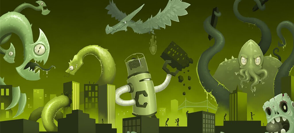
Your website is now your most important marketing tool. It is your digital space that affects how your users interact with your brand. We like to think of this space as a city. It sparks a community, provides endless avenues of creation, and connects others to your brand around the world.
But as everyone who’s managed a website knows, there are forces constantly working to destroy it. You know them — the monsters you encounter every day that threaten to flatten your web city and undo all of your hard work. Wrecked budgets, redundant content, mid-project changes and those digital marketing long-shots that cause web managers to run in fear.
It’s time we identified these monstrosities, and did something about them.
The Monsters of the Web
In any battle, it’s important to know what you’re up against. You’ve seen these beasts before and we know they are keeping you up at night (they scare the heck out of us):
Content ROT

You’ve neglected them since 1997, when they were pasted directly into a WYSIWYG from WordPerfect. Now all those pages of dead content are back and out to eat your entire web project alive.
What is ROT? The redundant, outdated, trivial content that sneaks up when you have more CMS contributors than editorial direction.
CthulURL

You’ve put a QR code on every piece of loot in your marketing closet and hired interns to manage 37 social media accounts. You’ve tried videos, blogging, PPC, SEO — and now your boss is demanding that you “make the next e-blast go viral.” Your organization’s got its hands in every marketing channel under the sun, so sooner or later something’s gotta work…right?
Swoop N’ Poop

The ol’ swoop and poop. At first, saving time on “unnecessary” status meetings and project updates seemed like a great idea. But now the boss wants to know where we are with the website. Oh, and by the way, there are a few ideas she’d like to share…
Design by Committee

Your boss just wanted it to “pop” a little more… be a little more “dynamic.” That other guy wants every image to be parallax. The three other people in the room? Bigger logo. Fantastic.
Now there are so many things going on with this design, the only thing to do is RUN.
Sssscope Creep

“Amazon’s army of full-time developers did it, so let’s make one like theirs. Only different. Should be easy, just use Facebook as an example. Oh yeah, and make sure it integrates with our calendar app. And loads on the CEO’s flip phone.”
A conversation heard in every developer’s nightmares. That 1 month project just jumped to 9 in a Flash.
3CL1ks

Research data does not compute. This expert already knows what users want, and it’s a rotating image carousel with music that auto-plays on page load. And a drop-down mega menu with your entire site map in it.
Take Them Down A Notch
It’s time we stopped these web monsters. The launch of our new services and workshop offerings are designed to eliminate them through smaller engagements. Now you don’t have to rebuild your entire city every time you have a minor infestation.
Catch ‘Em All

Talking about the issues with your website can be a bit daunting, so we wanted to do something snazzy. We decided to bring these ugly beasts to life!
Ask us about our swag when you see us out for conferences, talks, and meetings. We’ve got some cool stuff to hand out, like shirts, stickers, and posters. We are only releasing two at a time, so keep checking back with us to collect each monster.
Take them back to your office to remind yourself how you’ve defeated the monsters.

