At NewCity, accessibility is at the heart of everything we design. We believe that digital experiences must be usable for everyone, including people with disabilities. In 30 years of web design, we’ve seen all the trends. The best ones don’t just look cool, they make your website easier, more intuitive, and more enjoyable for every person you serve.
Web design will continue to evolve, but accessibility must stay built in. In this article, we explore 2025’s top web design trends through the lens of accessibility—highlighting what works, what doesn’t, and how higher ed institutions can create more inclusive digital experiences.
Here are our top trends and tools for 2025 as they apply to higher ed websites.
1. Simplified User Interfaces
It’s nice to see that a standard UX best practice is now being embraced by users in general. A clean interface, clear navigation and simple IA minimizes complexity and enhances usability. And for prospective students whose biggest goal is often finding their desired degree program, a streamlined navigation will get them there quickly and easily.
“A university website has a lot of audiences, goals, and tasks to balance in one interface. The key is to prioritize the content visually to help users find things in the right place at the right time. With clear headings, grouping things by topic and user task, and using design elements like color and space to convey hierarchy, you can have a ton of content without it feeling overwhelming. “
– Rachel DeLauder, NewCity Director of UX and Content Strategy
Example:
La Salle’s website solves for a top user goal right on the homepage, and makes key student journey conversions easy to complete with their simple Request Info/Visit/Apply navigation header.
2. Sustainable Web Design
This sounds like a buzzword, but it’s really about building websites and experiences that are energy efficient, last longer and minimize environmental impact – all of which can improve accessibility. How?
- Reducing the energy required to load and run a website by using clean, lightweight code to minimize server processing. This benefits users with slower internet speeds or older devices.
- Optimizing page speeds and minimizing unnecessary elements makes navigation easier for all users, particularly those relying on screen readers.
- By designing longer lasting websites and digital products using scalable design systems, reusable components and modular future-proof code. These practices ensure that websites will remain accessible as technology evolves.
Example:
Accessibility was a big priority for the University of Tennessee, Knoxville, and one of the key reasons why they chose a university-wide adoption of the design system we built for them. Now they can scale their web presence with confidence that accessibility features are applied consistently across their whole system.
3. Experimental Navigation
Experimental navigation is the practice of structuring a website’s navigation using non-traditional elements and patterns like unique layouts, motion and scrolling effects that run contrary to user expectations.
In general, use of this trend is not recommended for accessibility. It’s also not a good option in the design of informational websites with goal-oriented tasks like completing an RFI or applying to a school. The costs to get it right usually outweigh the benefits.
However, when the goal of the site is less task-based and intended to support exploration and discovery, this approach can work. But accessibility features must be implemented, like a sticky navigation menu, and testing the site for keyboard and screen reader friendliness.
Example:
NewCity client Oklahoma State University’s microsite We Are Land Grant used a side-scrolling navigation to explain their land grant heritage in digestible sections using words, images, videos and graphics. They told a story, and communicated strong OSU brand signals at the same time.
4. Motion Design: Parallax Scrolling
Motion design uses animations, transitions and movement in a digital interface to support storytelling and give users a more dynamic experience. Parallax scrolling makes background and foreground elements move at different speeds, creating depth and a sense of immersion.
This technique is great for institutions who want to tell their story visually, evoking emotions, and a strong sense of brand and aesthetics. It also meets the needs of potential students who have come to expect interactive, contemporary digital experiences.
Unoptimized, and used too heavily though, these methods can slow down page load times and even overwhelm users with cognitive sensitivities, decreasing accessibility and usability.
“Strategic, subtle use of parallax and introanimations transforms motion design from a fleeting spectacle into a powerful tool for usability—guiding attention, creating flow, and enhancing interaction without overshadowing vital content.”—Rodger Bridges, NewCity Director of Design
Example:
CalArts redesigned website is a rich, dynamic and accessible visual environment that uses parallax effects to move users over custom graphic elements and patterns that float behind vibrant content.
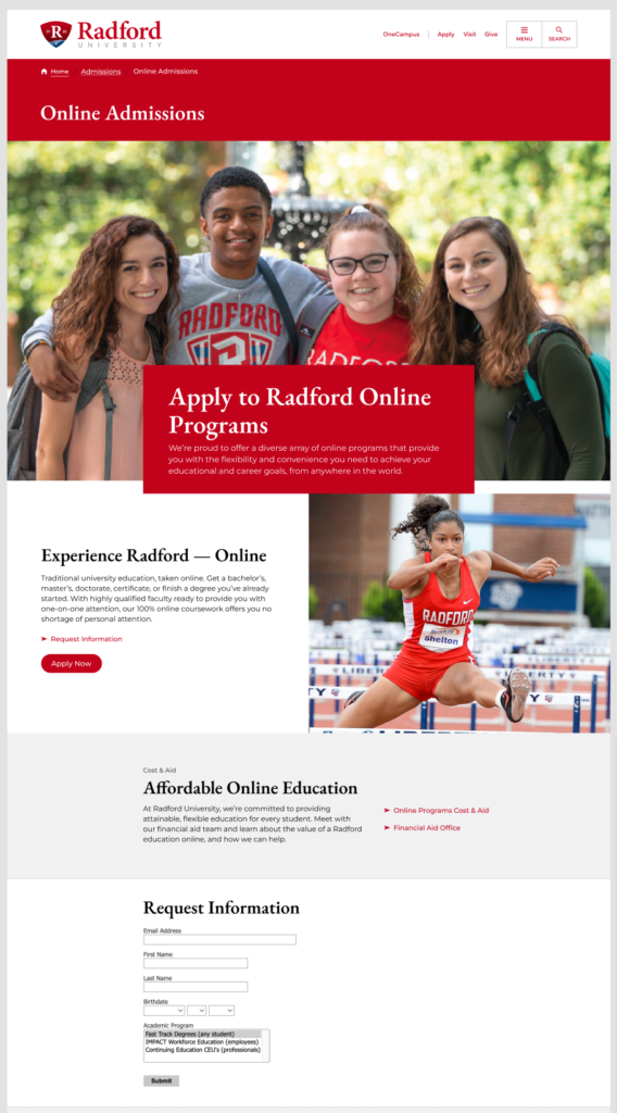
5. Progressive Lead-Nurture Forms Integratedwith Slate & Third-Party Platforms
Form design has come a long way. Unsightly, clunky forms have now been swapped out for information capture that follows good UX principles like progressive disclosure, where users are asked to share small amounts of information in stages.
The best examples of these lead-nurture forms look and feel like your brand. Your brand colors, logos, fonts are styled in, giving users a unified brand experience that maintains engagement along the enrollment journey and helps you stand out.
“It’s so hard for those of us in enrollment to dial back our eagerness regarding an RFI form. It feels like it is my only chance to get to know everything that I can about you. But let’s build a mutually beneficial relationship that prioritizes engagement over the data.”
-Robynne Lofton, NewCity Director of Enrollment Strategy
Example:
Radford Slate Pages and journeys are a good example of RFI form best practices built into user experience and a content strategy that supports enrollment goals.
6. Inclusive and Ethical Design: Accessibility
Over the last decade or so, digital accessibility measures have become widely adopted. But as of April 2026, an update to Title II of the Americans with Disabilities Act (ADA) will require public higher ed websites to comply with Web Content Accessibility Guidelines (WCAG).
Now functionality like alt-text, keyboard navigation, color contrast, screen reader design, resizable text and responsive layouts will be commonplace, and designers will go above and beyond compliance by building accessibility into their designs holistically, using typography, color psychology and smart content hierarchies.
But this trend is also about the language we use when we design and build websites. As accessibility becomes a broader conversation—not just access for people with disabilities but access for people and communities that have often been overlooked —it’s prompting designers, marketers, and higher ed leaders to rethink what it truly means to create digital experiences that are usable, welcoming, and meaningful for everyone.
“Website accessibility should never be thought of as a trend or an add-on. It must be baked into the foundation of every project. It’s called Human-Centered Design and at NewCity we do our best to be aware that humans come in many varieties with varying needs. We know that every website visitor is a human with a goal to complete some task and it is our job to remove any obstacles to completing that task. For example, making sure the main navigation on the UCLA Broad Stem Cell Research Center is made up of easily understood words that can be navigated with a keyboard so any user who wants to see the list of clinical trials can get there.”
– Troy DeRego, NewCity Web Developer
7. Custom Graphics and Illustrations
Designing within component-based design systems can feel limiting until you know where and how to add the visual details that tell your school’s authentic story. Clients are interested in custom component design, patterns, graphics and illustration-style details. Generic graphics and stock photography are out. Clients are now pulling from the history and culture of their institutions, and weaving in small graphic details that add interest and build their brand.
Example:
Radford University wanted to incorporate visual elements inspired by their location in Virginia’s Blue Ridge Mountain region, to give prospective students a sense of place as they explored the website. Our designers integrated overlapping mountain silhouette graphics and Radford’s classic tartan into design system components, giving these elements depth and texture.

8. Dark Mode
Dark mode isn’t a new trend. The first computer monitors used dark mode out of technical necessity (does anyone remember the original green-on-black CRT displays?). Light mode was introduced later and became the norm until dark mode’s design comeback a few years ago.
While dark mode can improve readability for some users, it can also introduce challenges—especially for those with certain visual impairments. The key to making dark mode accessible is providing users with choice (light/dark toggle switches and prefers-color-scheme system settings), and ensuring proper contrast to meet WCAG standards, readability, and usability across both light and dark.
9. Color Contrast and Visual Design
The use of color contrast is a core accessibility measure because it improves readability for users with limited vision, and makes key content easier to find on a page. Designers are now building on color contrast for accessibility compliance, and using color to enhance user experience and brand storytelling too.
Bold, high-impact contrast pairings, saturated hues, gradients and neon effects are showing up on web pages to create visually stimulating interfaces that meet WCAG contrast ratio recommendations and maintain readability.
Example:
UCLA Broad Stem Cell Research Center’s website uses subtle but impactful component gradients upon scrolling, and bold color gradients for key data points on the home page.
10. Microinteractions
Microinteractions are subtle animations and feedback that guide users through tasks and improve usability. On higher ed websites, they play a crucial role in accessibility—especially within forms and navigation—by improving clarity and supporting assistive technologies like screen readers.
Key accessibility-focused microinteractions include:
- Field validation and error messaging within form interactions (ex: Please enter a valid email address” appears with a red border and an ARIA live region update for screen readers.)
- Progress indicators for multi-step applications that reduce cognitive load
- Auto-Save and form resumption for long application forms help users who need more time to complete tasks.
- Hover and focus states for navigation like links and buttons that change color, are underlined or in bold on hover and keyboard focus. This supports usability for those using a keyboard or assistive technology.
Example:
Accessible microinteractions can also be really fun. For CalArts student acceptance emails delivered via Slate, NewCity created custom SVG confetti that mirrored the multi-colored abstract shapes of the Calarts website’s design language.
Looking ahead
Every innovation in web design should make websites more usable, intuitive, and inclusive for everyone. As we move into 2025, higher ed institutions have an opportunity to embrace new tools and design approaches that prioritize accessibility from the start.
If you’re thinking about how to make your website more accessible, we’d love to help.

Nicole is NewCity's Marketing and Communications Strategist.