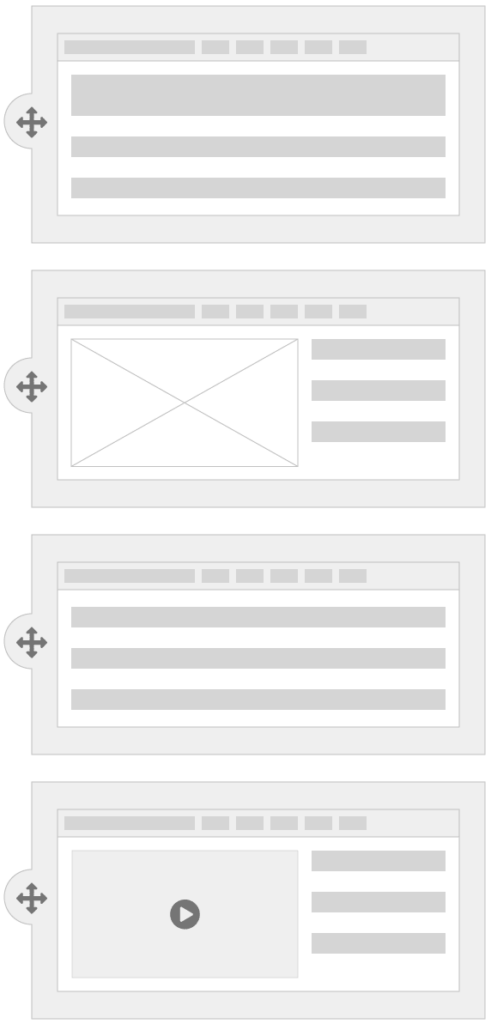
A good UI design system combines content patterns–both standard and custom–with guidelines and examples. Also known as component libraries, these systems provide structured, reusable building blocks for web development.
Since NewCity first started building UI design systems many years ago, their definition has expanded. Now, when you hear the term “design system” it might also refer to brand identity guides, digital products, and even design processes within organizations.
Our approach to building UI design systems has evolved too. We’re now incorporating storefronts, design tokens, and structured guidance on documentation and governance for clients. As design systems become more powerful, they’re helping teams scale digital presence to support organizational growth, assist with cross-functional team collaboration, and enable brand consistency that just wasn’t possible before.
Why Use a UI Design System?
When NewCity creates a design system, we usually start with the most commonly used content page patterns. Then, we develop any other patterns needed for special content like landing pages.
A design system has many advantages over a template-based website by providing you with:
- Consistency – A defined set of styles and layout components promotes a consistent experience across your web presence.
- Platform Flexibility – No matter which CMS you’re using across your organization, you can deliver a unified brand experience.
- Shared Vocabulary – Orderly naming schemas improve your team’s efficiency and gives you and your website a common language.
- Less Code to Maintain – Larger components in the design system are built from smaller components which allows you to isolate bugs and problems more easily.
- Prototype Faster – Simplified, modular code means your team is able to build faster prototypes. While building and testing the design system is a big initial project, once it’s established you can create new layouts and test concepts in minutes, not hours.
- Accessibility – Building and testing patterns for accessibility compliance from the beginning means you don’t have to wonder if every corner of your site is accessible or not.
- Planning: As you plan a design system, you identify recurring patterns to define modular building blocks. With that organization in place, it’s much easier to know what you can build and how you’re going to build it.
Since we first published this article in 2021, several advancements have shaped the way UI design systems are developed and implemented. Notably, component-driven development in Storybook has enhanced collaboration and documentation, and accessibility measures, including WCAG compliance, are now built in from the start.
Using a UI Design System With Your CMS
Once a design system is integrated into your CMS, building pages becomes more efficient. Users can select layout components tailored to their content, with options for customization (e.g., color schemes, data fields, alignment). Someone with expertise in web content strategy can usually select and use components appropriately with minimal training, but we’ll provide guidance on best practices for use of your design system.
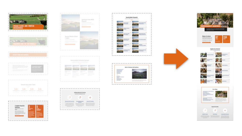
The illustration below shows how OSU combined components from their design system to create the Undergraduate Academics landing page for Oklahoma State University.
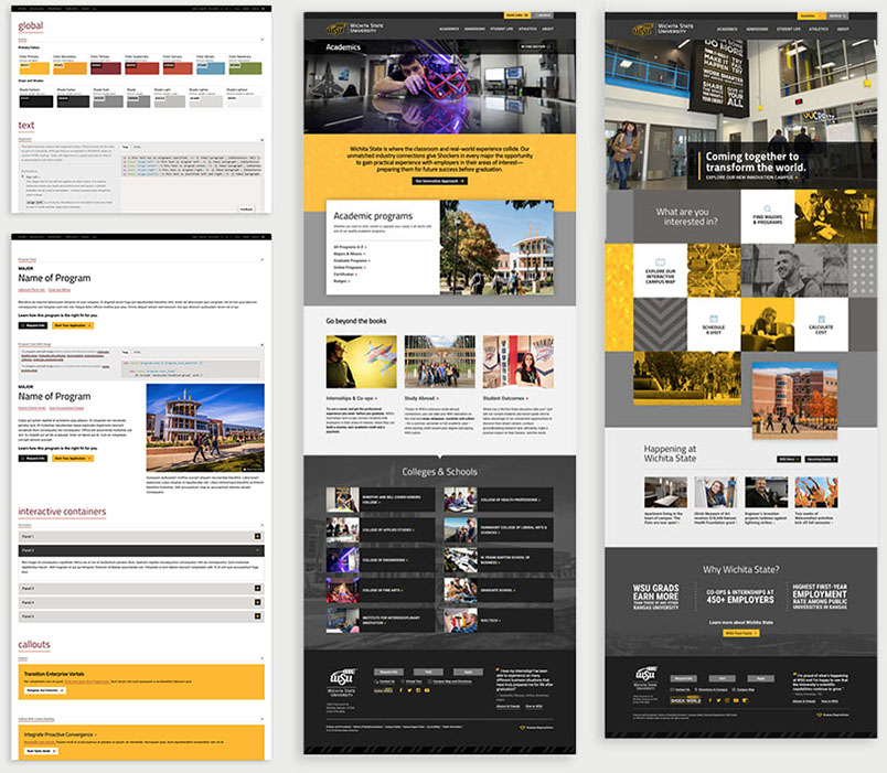
Below are examples of the component library created for Wichita State University and pages created from that library:
Using a Storefront for Your Design System
One exciting recent advancement in design system practice is the use of storefronts.
A storefront is a user-facing repository of all the elements in your design system. Like products on shelves, a storefront displays components and design tokens into an easily navigable interface, allowing designers, developers, and content editors to find the elements they need without sifting through documentation manually.
The benefits include improved usability, faster development, and better collaboration between design and development teams.
For more insights on storefronts, read Master Design Systems: 3 Steps to Building Your Component Storefront in WordPress by NewCity developer Mike Henderson.
Documentation and Governance
A design system is only as powerful as the people using it, so it’s important to provide support and documentation as those people learn the system, and as new features are added.
At NewCity, we use GitHub to publish updates, ensuring transparency and version control. Other documentation tools like Zeroheight and Lona (by Airbnb) help teams track changes and collect feedback from system users in an organized way.
Governance is a critical component of any design system. Establishing clear roles, responsibilities and communication pathways can help the system scale alongside institutional needs.
Typically, governance includes:
- A dedicated team – Usually led by web/IT, but collaborating with marketing and communications teams who manage brand guidelines.
- A structured process – Regular updates, stakeholder input, and feedback loops to ensure continuous improvement.
- Cross-departmental collaboration – Aligning web governance with institutional goals and ensuring all stakeholders are represented in decision-making.
Developing a structured approach to governance will ensure your design system is set up to grow with your organization. And it will keep your contributors and stakeholders a lot happier.
Read the University of Tennessee Knoxville Web Design System case study to see how NewCity partnered with UTK to build a design system that was tested through a pilot program, then rolled out to the entire university system.