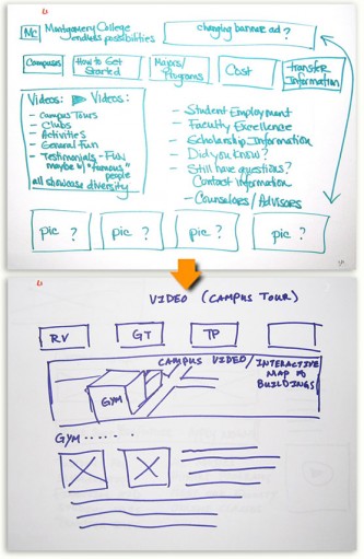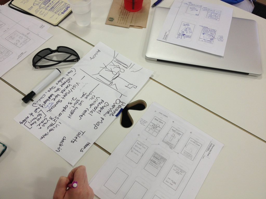
Design consequences is a fun twist on UI design sketching. Participants sketch an idea, then pass it to a partner to design what comes next!
This exercise demonstrates a couple of things to your participants:
- Everyone has their own interpretation of what the redesigned website should look like. Even if they’re all agreeing on words like “dynamic,” “elegant” or “innovative,” their mental pictures can be quite different.
- While no two participants will share the exact same ideas, each can use their perspective to their advantage and learn to incorporate others’ ideas into their own.
As the facilitator, you’ll gain a better understanding of how people imagine the end product. It’s up to you how to incorporate these ideas.
You’ll need:
- Blank paper
- Markers or pens for sketching
If you’re doing this as a virtual workshop we still recommend sketching on paper. People can share pictures of their sketches with a phone or scanner app.
Design Consequences Steps:
- Identify a problem or scenario with the website or app. What is a user trying to accomplish? What are you trying to accomplish as an organization?
- Have participants take about seven minutes to individually sketch an idea for the first screen. Use markers or thick pens, since it’s hard to show sketches done in pencil or lighter weight pens.
- When the time’s done, each person passes their sketch to the person on the left.
- With a new screen in front of them, participants pick something on that screen that interests them the most and pretends to click or tap it. Then they take another seven minutes sketching the screen they think would come next.
- After the second round, have participants share and discuss their sketches.
- Ask them why they made the choices they did: Do they see anything from other designs from which they could have benefitted? What would they keep? What would they do differently?
Design Consequences is a workshop we learned from Leisa Reichelt. Read more of her work on Medium.

