When we visit a client in their environment, we really get to see and experience who that client is: what makes them unique. That intangible feeling insiders try to describe. It’s not just one of the most efficient and effective ways to get a project started on the right foot; it’s one of my favorite parts of the job.
I recently had the privilege of going down to Auburn, Alabama to visit with the College of Education at Auburn University. Having spent several weeks on stakeholder interviews, audience research, and analytics, we were ready to share and validate our findings to begin generating ideas.
This particular trip included two days on site with faculty, staff, and students in collaborative workshops and brainstorming sessions. It took a lot of preparation on our end and excellent coordination and hospitality on Auburn’s. But we walked away with a richer understanding of their goals, audiences, and value proposition, as well as a clear direction for the structure, content, and design of the new website. (All that in just two days!)
To give you an idea of how we did it, here’s a look at one of our website redesign workshops affectionately referred to as the “Design-UX Mega Session.”
Step 1 — Describe
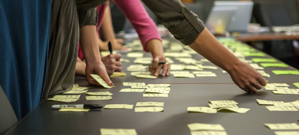
We start by arranging 200-300 cards on a large table. These cards contain photos, illustrations, font styles, and other types of imagery. We ask participants to walk around the table and pick one to three cards that embody the organization (in this case, Auburn University’s College of Education) and a single word to describe it.
Each person shares their card selections and displays them on a wall alongside the words the cards represent. If two people choose the same word, they post the cards next to each other.
Next, we give each participant an equal number of stickers, or votes, to choose the words they think best describe the College of Education. (Faculty, staff, and students are on a level playing field in these workshops.) This narrows our original wall of 40+ words down to six.
What We Learn
- How insiders view the organization (and how they want others to)
- What visual styles resonate with them
- The collective values of real people within the organization
Step 2 — Depict
Now that our word list is more manageable, we can dig deeper to find out what these words really mean. Using a different color of sticky notes, participants generate additional content:
- Supporting words/phrases to help explain the main word
- Stories to demonstrate it
- Multimedia (existing or hoped for) to depict it
These “word clouds” become a source of inspiration for the final step.
What We Learn
- Specific connotations of words
- Real examples to back up those words (in this example, one of the six word clouds had no stories associated with it, so that was a red flag)
- Opportunities for visual representations
Step 3 — Design
We divide the group into mixed teams of two to four participants and distribute several paper variations of blank layouts to design a new homepage. Each layout has five regions.
Teams then pull five objects from the wall (images, words, stories, etc.) to place in any region. They determine the best layout to display their content and add detail where necessary.
Each team presents to the group.
What We Learn
- What they’re most proud of (hint: which cards do teams fight over?)
- What layouts they gravitate toward and why (in this session, all but one of our teams chose the same layout)
What They Learn
As you can tell, we learn A LOT during this activity. But another crucial outcome is what our clients learn. By being involved early in the process, they learn that:
- Specific, meaningful content is essential to conveying who they are.
- Layout, design, and imagery comprise only part of a website redesign project.
- It’s hard work.
For those who haven’t been through a website redesign before, this last one is perhaps the greatest takeaway. Even in this one workshop, clients catch a glimpse of what is to come. By working together to flesh out and prioritize ideas, we create concepts that thoughtfully, authentically, and creatively communicate with the rest of the world.
And that’s why I love it.

