Nuts &
Bolts
Timeline
Feb 2023- October 2024
Project Scope
- Stakeholder Research
- Enrollment marketing discovery
- Audience research
- Project strategy blueprint
- Experience mapping (enrollment journey)
- Design explorations
- Top level site architecture and navigation strategy
- Page layout and design
- Content work plan
- Component library build (HTML, CSS, JS) in Storybook
- Quality assurance, responsive behavior, and accessibility testing
- Content buildout
- CMS & Storybook training
- Slate page design and imbeds
- GA4 & Google Data Studio Planning
CMS
Drupal (Pantheon Hosting)
Site Size
About 500 pages
CalArts was founded in 1961 by Walt and Roy Disney, as an inclusive home for artists collaborating across disciplines. Over fifty years later, it is still what Calarts calls “a fiercely countercultural version of Disney’s utopian concept”. In the eyes of the world it’s a premier West Coast arts institution, offering degree programs across six disciplines of art, critical studies, dance, film/video, music and theater.
In 2022, NewCity and CalArts teamed up to design the Roy & Edna Disney CalArts Theater (REDCAT) website, which dramatically elevated the center’s profile amongst its audiences. When it came time to redesign CalArt’s main web presence, the team brought the ambitious project back to NewCity.
Our discovery process revealed their challenges, goals and opportunities. The existing site was 8+ years old and didn’t meet accessibility standards. It was full of rich arts content, news and faculty profiles, but there was little definition and promotion of what makes CalArts unique from other art schools. And each school was on a separate subdomain, making universal changes difficult, and governance even harder.
Their vision was a beautiful, functional, accessible site that engaged their diverse audiences, reinforced their position as the most prestigious art school on the west coast, and was easy to manage. An essential outcome: it had to feel like Calarts.
After a series of stakeholder interviews to understand internal goals and priorities, NewCity undertook audience research for insight into the needs of two prospective student groups. We did enrollment journey mapping to help build strategies for IA, navigation structure and enrollment conversion paths. Then we outlined content strategy and messaging to capture the heart of the CalArts experience, and to support differentiated storytelling across the six schools.
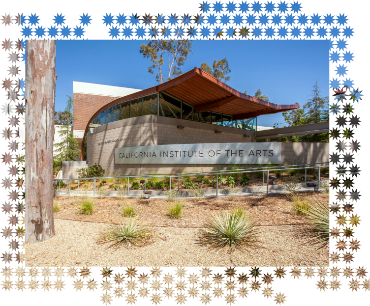
Then we moved into a very special design phase. NewCity’s Director of Design Rodger Bridges explains why:
“Typically, we lead the visual design process from start to finish, but for the CalArts redesign, it was essential that the site feel authentically “CalArtian.” To achieve this, CalArts paired us with Handbuilt — a studio that includes three generations of CalArts alumni. This collaboration allowed the visual essence of CalArts to emerge naturally, shaped by creatives deeply rooted in its unique culture. Together, we transformed Handbuilt’s inspired visual language — colors, fonts, design concepts, and elements — including shapes and patterns synthesized from the music of a CalArtian musician.”
Working closely with Handbuilt, NewCity’s design and front-end dev team incorporated the visual language into a powerful design system that was accessible, flexible and scalable. This phase of the project required creativity, problem-solving and full team collaboration to ensure the full scope of the design could be applied to the CMS and give CalArts content editors the control and creativity to bring their arts content to life across pages.
This collaborative effort between CalArts, NewCity, and Handbuilt was an inspiring experience, yielding a new digital space that feels unmistakably CalArts: vibrant, exploratory, and reflective of its dynamic, creative community.
Design Languge: Cross-pollinating patterns
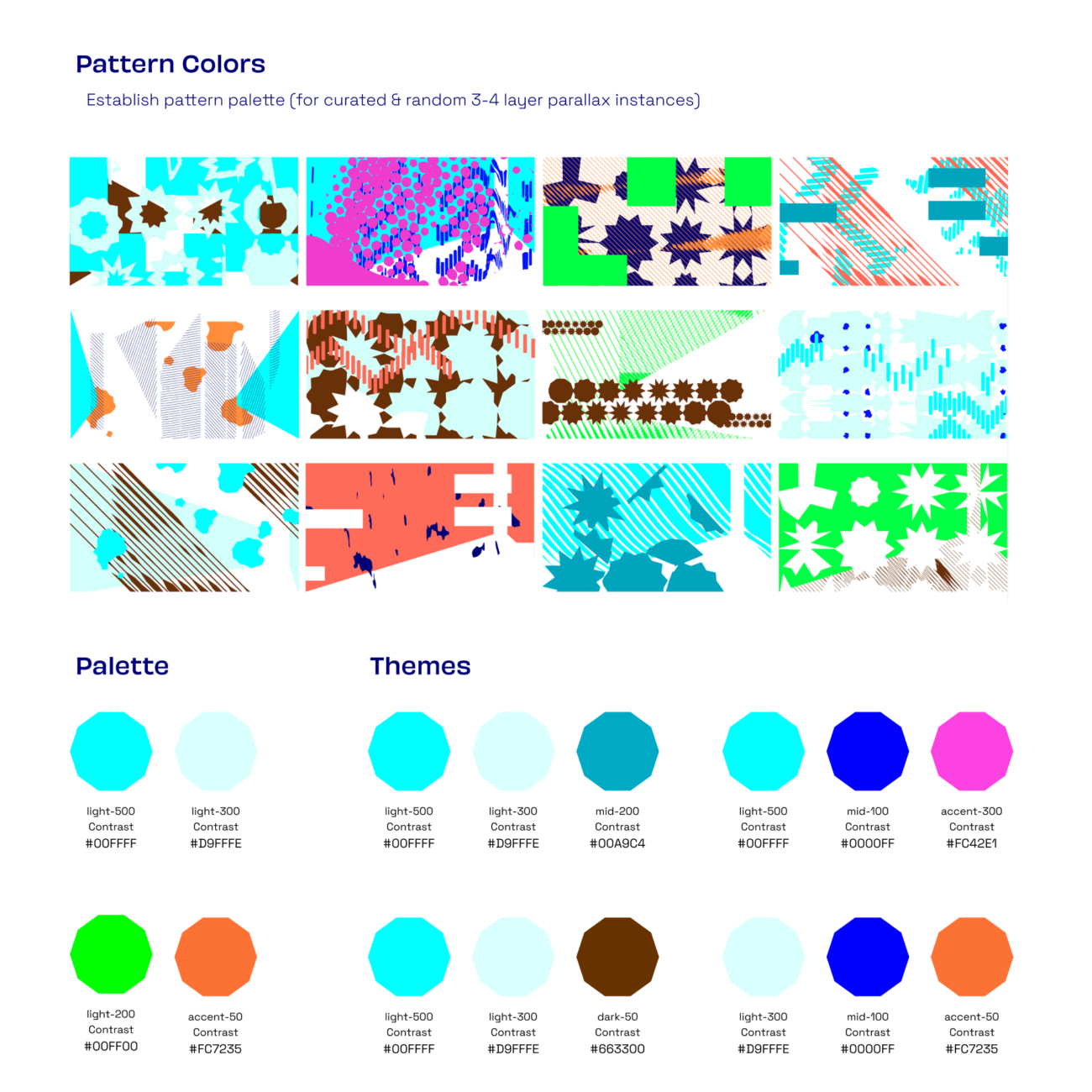
In close collaboration, NewCity’s design and front-end teams brought Handbuilt Studio’s vision to life using uniquely shaped buttons, custom cursors, parallax effects, and randomized content-graphic element pairings — using a library of full-page SVG backgrounds composed of varied colors, patterns, and shapes. This approach was designed to embody the Handbuilt/CalArts’ concept of “porosity,” where people and elements interact and evolve into something new. The result is a visually rich, cohesive and accessible system that pulses with rhythm, contrast, and vibrancy, inviting exploration on every page.
Want to talk enrollment strategy?
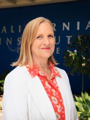
Enrollment Services is led by Robynne Lofton whose career spans 26 years in enrollment management positions.

