PATRIC
The site targets biologists who use gene analysis in their research, but don’t specialize in informatics. Our research showed they were interested in the tool’s potential, but found the learning curve too steep.

Nuts &
Bolts
Project Scope
- Discovery and audience research
- Personas and sketching workshops
- User experience design
- Adapting the homegrown JBoss website for WordPress integration
Timeline
2007-2015
CMS
Proprietary framework for the main site; WordPress for the news section
Bringing User-Centered Design Thinking to a Room Full of Data Scientists
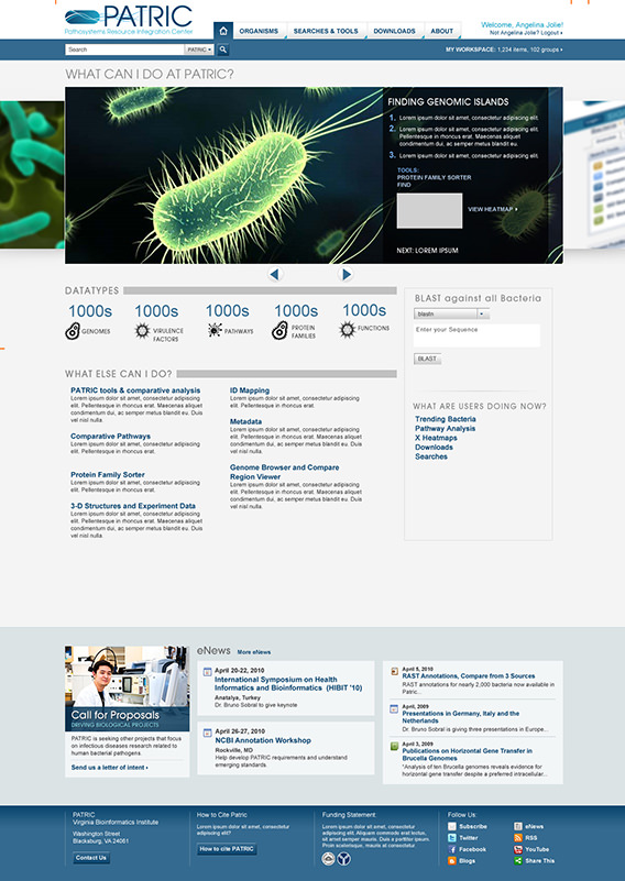
The Pathosystems Resource Integration Center (PATRIC) is a series of tools designed to support research on bacterial infectious diseases.
It hosts a vast amount of genomic data analysis software that retrieves, visualizes, and compares information for biological science research. The PATRIC website is a project of the Biocomplexity Institute (known as Virginia Bioinformatics Institute during our project) funded by NIH’s NIAID.
They came to us looking to make the website more relevant to bench biologists, showing them how to wield these powerful bioinformatic tools in a way that would be meaningful and reproducible.
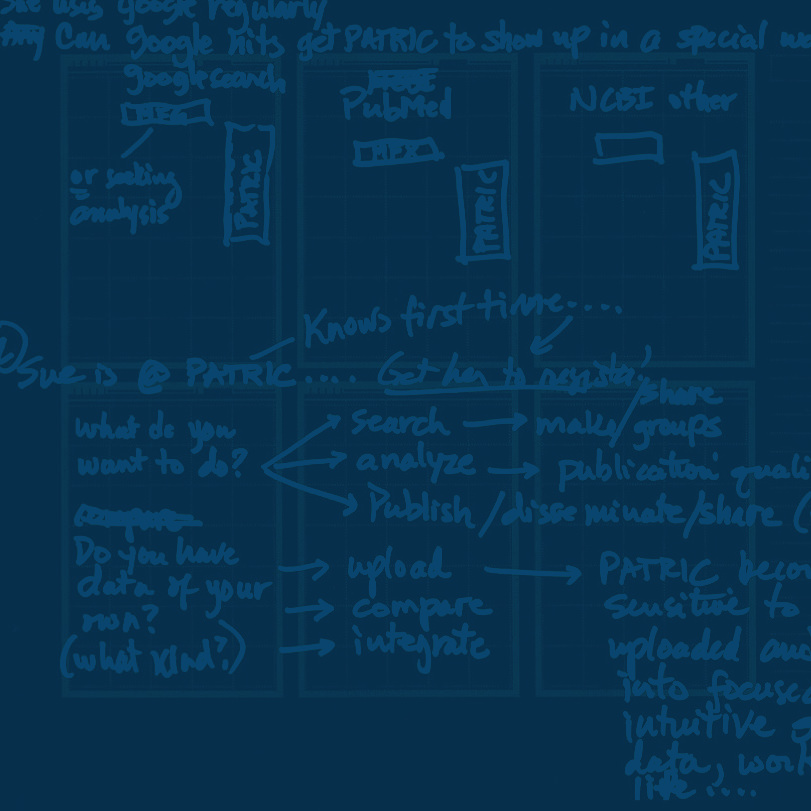
We conducted audience research to construct a target user persona that would inform the structure of the new website. Then we facilitated a series of sketching sessions with software developers, epidemiologists, project managers, and principle investigators, from all levels and backgrounds.
Other facets of the site overhaul:
- Designing a more effective user interface that would appeal to researchers across a variety of disciplines.
- Adapting their main JBoss website (which didn’t have a content management system) to work with WordPress, so non-developers could manage editorial content more quickly and easily.
During the 2011 E. Coli outbreak, the PATRIC website was at the forefront of helping scientists perform research to identify the cause.

We needed to present the value proposition and make it clear why you would bother to learn this new tool — because it allows you to tabulate big data quickly and see patterns that you can't see otherwise, to make these discoveries that you couldn't before."
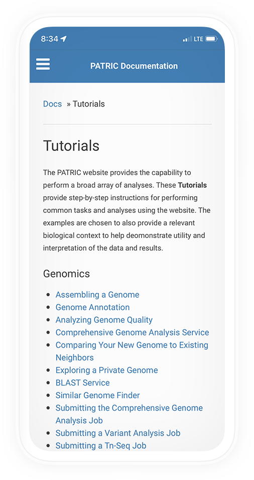
Designing a Right-Sized Tutorial
We led subject matter experts with deep knowledge of PATRIC’s tools through an intensive design thinking process. This gave our user experience architects a better understanding of use cases and specialized domain knowledge, so we could create a design together that would work for the target user persona — the biological (not big data) researcher.
The collaborative work produced inventive workflows based in stories of real research. It helped us design a system that could onboard researchers from a different domain without an over-simplified tutorial that experienced scientists might gloss over.


