Nuts &
Bolts
Project Scope
- Discovery and audience research
- User experience and information architecture
- Extension of existing front-end pattern library
- Content strategy, governance training
- Drupal 9 implementation
- Post launch support
Timeline
Jan 2020 – July 2021
Launch Date
July 2021, refresh July 2023
Rutgers University Libraries (RUL) support over 9,000 faculty, 71,000 students and numerous external groups. They partnered with NewCity to reimagine their web presence, bringing four separate websites together to present RUL as one library with four missions. The four locations have distinctive collections and services:
- New Brunswick: the flagship campus, serving researchers and students with extensive archives and special collections across 9 locations on campus
- Newark: serves the campus and local community; home to the Institute of Jazz
- Health Science libraries: housed in both New Brunswick and Newark; distinctive courses of study and research needs on each campus
- Camden: serves Rowan University and local community college students; houses the local public library.

Another challenge was that, like many academic libraries, Rutgers had a complex network of disparate systems, including tools like:
- Ex Libris’ Primo search for the core discovery pieces
- SpringShare’s platforms for the research guides, event calendar, room reservations, and chat reference
- Custom-built tools including request forms for both internal and external use
- The CMS, which brings it all together
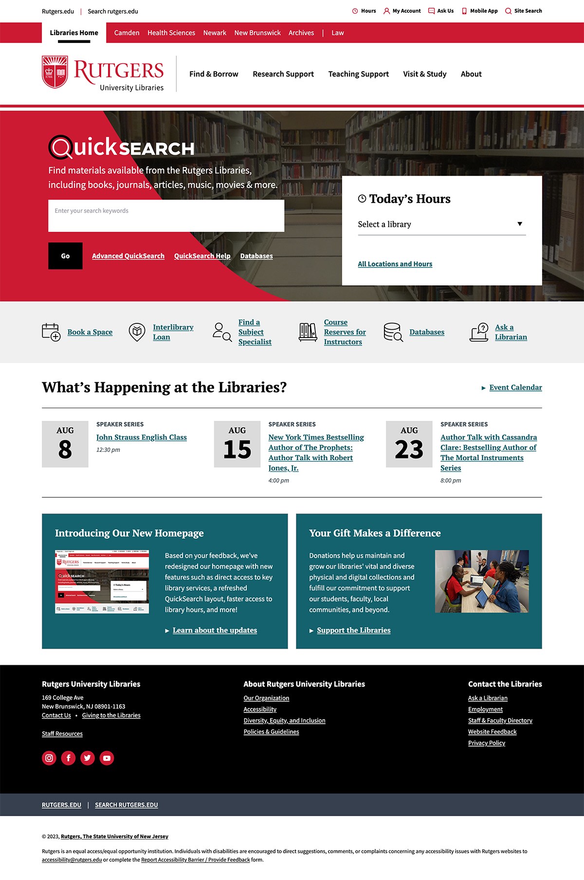
To create a single website we needed to make sure each library team could communicate with their particular audiences in relevant ways. We created individual strategies for each library location based on their goals, audiences and outcomes, then built a sustainable, maintainable infrastructure that could support each location.
During our audience research we identified several trends that influenced the site strategy:
- Friendly, scholarly messages are universally appealing.
- We saw subtle but important differences in behavior across the locations.
- Improving navigation could broaden awareness of service scope.
We pursued these strategies based on our research insights:
- Build the site on a single CMS instance, but provide local navigation with headers and footers specific to each library division/campus.
- Provide reusable core content snippets that can be embedded into pages so users aren’t confused jumping between location pages to get common info, and to allow content updates to core services to be made in a single place, even if that content appears across multiple sites.
- Design layout patterns tailored to library content. Rutgers already had a design system for its various websites, but it didn’t provide the patterns we needed for common library tasks like information retrieval. We created a pattern library with heavy emphasis on helping users navigate through a page and select between different resource options..
- Map navigation to terms familiar to our users. We created and tested a navigational vocabulary based on how people naturally refer to their goals.
- Simplify the complex. We designed user journeys that reflect the librarian’s passion for helping everyone without overloading them with information.
Initial Outcomes
The new RUL site provides a “local” campus experience without compromising the overall user experience around shared library resources. Usage of the site post-launch shows an increased level of engagement with local library sites. Post-launch usage data shows that people are able to more quickly access (and discover) the resources they need. Abigail DePaulo, Executive Director of Administration and Technology, spoke of the feedback she’s received: “People love the new site so far and are extremely pleased with the streamlined access to central content.”

