Nuts &
Bolts
Timeline
February 2024 – October 2024
Project Scope
- Discovery & Audience Research
- Information Architecture
- Content Strategy
- Page Design in WDS
- Content Buildout
- Prep & Launch
CMS
WordPress
Site Size
Approx. 120 indexed pages
NewCity and UTK College of Social Work partnered as a blended team, applying research, strategy, and training to maximize the design system.
After a year of collaboration between NewCity and the University of Tennessee Knoxville (UTK) to create their new WordPress-based Web Design System (WDS), UTK initiated a pilot program to test it with a select group of colleges and units. Each unit in the WDS pilot could choose to work with any agency on UTK’s approved vendor list. The College of Social Work chose to work directly with NewCity to plan and implement their site in the WDS.

Our process for the College of Social Work
Working within the new web design system streamlined the process, eliminating the need for typical design and development phases. The process focused on these key phases:
- Discovery & audience research
- Information architecture
- Design (page layout and content, using patterns from the web design system)
- Content Buildout
- Prep & Launch
Preparing for the Redesign
Kendra Rudder, Director of Communications and Chief Strategist, and Ryan Murr, Web Designer, led the project on the CSW side of the team. Prior to the start, they had already done a content audit, identifying things that could be cut, streamlined, or moved to an internal site. They had the foresight to clear Ryan’s plate for the duration of the redesign, either deferring requests or relying on interns to cover some of his responsibilities.
Discovery and Audience Research
Our first two goals in Discovery are to 1) truly understand our client and 2) forge a united team.
In our stakeholder interviews and audience research, we identified a challenge about the perception of social work. UTK’s College of Social Work has been serving Tennessee for over 80 years with highly rated programs and a focus on meeting students where they are. But, students and parents don’t have a good understanding of what social work actually is or the diverse range of careers you can pursue with a degree in social work.
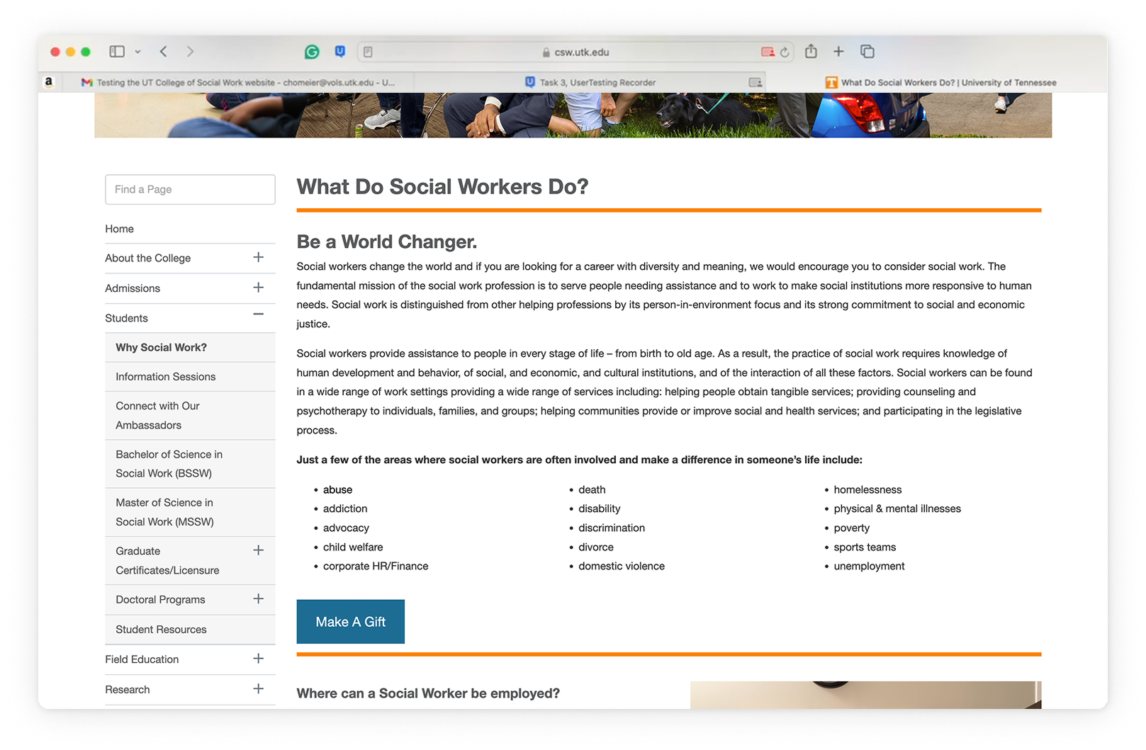
So, a major goal of the project became highlighting the flexibility of a social work degree, demonstrating outcomes, and showing how students can channel their passion into a degree. CSW had plenty of evidence and alumni stories to illustrate this, so we just needed to bring this to the forefront.
Information Architecture & Content Strategy
We developed a new navigation structure for the site to support top user goals based on the audience research we had conducted. The College of Social Work offers a lot of services to the broader public, including things like certificate programs that don’t fall neatly into the prospective undergraduate or graduate student bucket. It was evident that we needed to elevate “Continuing Education” to the top navigation level. But when UTK’s Office of Communications and Marketing was developing the WDS, they hadn’t planned to have continuing ed in a college’s main navigation. So, we were able to work with both groups to come up with a solution to give CSW the flexibility they needed.
CSW appreciated the way NewCity advocated for their needs, even though NewCity was also part of the WDS team.
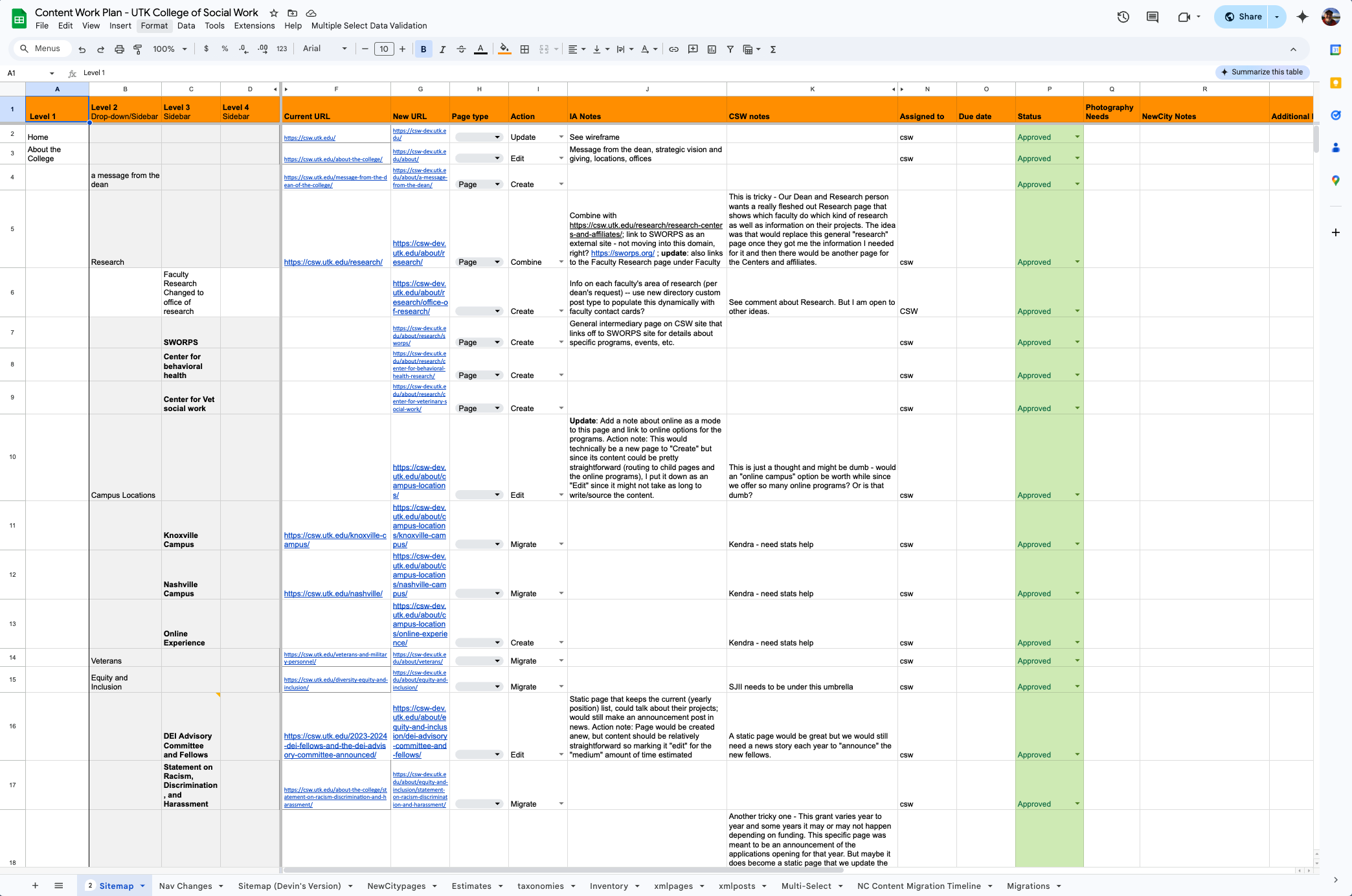
Once the site map was established, we expanded this into a detailed Content Work Plan spreadsheet that mapped existing content to the new architecture, identifying where content needed to be edited, created, or just migrated as-is.
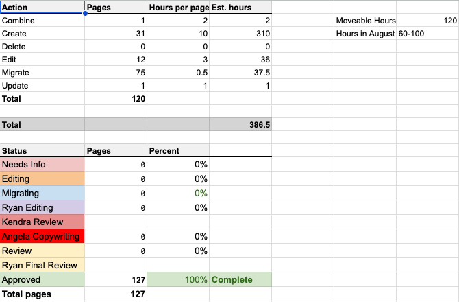
This graphic from the Content Work Plan shows how the site architecture expands into a detailed spreadsheet used to manage content work as it progresses. Floating above the sheet is an example of the formula we use to estimate the effort required.

Design
During Discovery, we used heat and scroll mapping to get an initial idea of how people engaged with the existing CSW site. These analytics tools revealed two key insights that informed our designs:
- Users were spending a lot of time trying to find pathways in the sidebar navigation while largely ignoring the body content of pages.
The colors in this heatmap overlay indicate places where a person’s mouse hovered or clicked. Notice the cluster of activity around the side menu, the “choose your path” buttons. and the footer links.

This is a classic example of misunderstanding the purpose of these kinds of pages. These pages exist to help you get to your goal content, which is almost never on the home page or a secondary landing page.
There are 3 questions every home page needs to answer, and quickly:
- Am I in the right place?
- Do you look legit?
- Do you have what I want?
If you fail any of those questions, users will generally back out and look elsewhere. If you satisfy those three, then they’re going to click whatever they see first that seems like it will lead to their goal.
Then, unless your website is super simple, the next page they hit is usually an intermediate page. They’re scanning that page and selecting the first option that looks like it leads on to their goal.
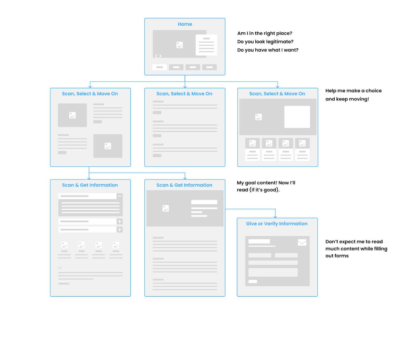
In CSW’s case, the only way to get to that goal content was through a sidebar menu with popouts, which are notoriously difficult for people to navigate in general – important keywords are often hidden. And the body content didn’t offer any obvious paths to their goal, so they ignored it.
Intermediate pages can be more effective if you just treat the whole page as navigation. Each block of content is about offering the user a choice to continue towards their goal. Content needs to be brief, and choices need to be clear so people don’t follow the wrong path by mistake.
- Users weren’t scrolling very far down the degree program pages and were missing a lot of valuable content.
A scroll map uses color to show what % of people scrolled to that point of the page. In this case, fewer than 25% of users went past the Certificates section of the Masters of Social Work degree program page.

People will scroll when they see compelling content, so the lesson from this observation is not that everything has to be within view on whatever device the user has.
This lack of scrolling can be impacted by:
- navigation and graphics that take a lot of vertical real estate on small screens, pushing valuable content out of view
- the way content is presented, so it appears as though the page has ended even when there’s more to see.
- users not seeing any evidence that the page has the information they want and leaving.
- long paragraphs of text that can’t be scanned easily.
Using the WDS to Improve Engagement
Thankfully, UTK’s new web design system offered a variety of layout elements both for in-page navigation and for presenting content and stories in a more compelling way.
We reworked the home page and intermediate pages to function better as routing pages. Shown here are wireframe mockups for some of these pages. They look like design mockups because we were wireframing using the WDS.
We designed layouts for the degree program pages that helped students understand the unique value of the program, their possible pathways, and visualize their outcomes.
A wireframe of the UTK CSW’s homepage built within the design system

Our work for the College of Social Work was also reflective of a mindset shift that UTK was pursuing for all of its websites under the guiding principle of “One University, One Website.”
CSW’s Dean, Dr. Lori Messinger, talked about how the wireframes were useful in helping her faculty understand this shift: “I like the university’s emphasis on this being an externally facing website that is user-friendly. One of the challenges in working with academics is they want everything on the page – more verbiage, more words- and we have to help them understand the importance of it being simple and easy. The structure and wireframes you created with us were helpful to gain that understanding with faculty and other stakeholders.”

Content Buildout
We worked for several weeks alongside the CSW team to edit and create content for the site following the Content Work Plan. During this time, we also held weekly content office hours – a regular session where any editor could meet with one of our content strategists to work through challenges and review ideas together.
“I thought it was going to be an absolute nightmare,” said Ryan, “but it wasn’t at all. The Content Work Plan was a lifesaver on more than one occasion. Being able to assign out who was doing what and seeing estimates of how long everything would take was very helpful on my end. We tackled the content migration as a team, each of us handling some of it. It honestly went smoother than I anticipated.”
Launch
Once content migration and editing were complete, we ran through our checklist of pre-launch tests, set up 301 redirects, final technical SEO steps, and prepared site analytics.
The new website went live in October 2024 and is now serving its role of attracting and supporting students while upholding the College of Social Work’s reputation as a national leader in the field.
